

Fruit Boom
Fruit Boom Beverages Ltd. was established in 2010 with a clear vision: to redefine the fruit soda category through bold flavour innovation and high-energy branding.
Creating a challenger soft drink brand built for shelf impact and instant recognition. In a crowded fruit soda market dominated by predictable packaging and safe branding, Fruit Boom needed to feel louder, bolder, and impossible to ignore. The goal was not just to launch a drink but to create a brand people noticed before they even tasted it.
Project
Branding, Illustration, Design
The Challenge
Winning attention in seconds Soft drinks live and die on shelf presence. Consumers make decisions fast and most competitors relied on:
• Familiar fruit photography
• Safe colour palettes
• Conventional beverage branding
Fruit Boom needed a visual identity that felt disruptive, youthful, and high-energy—something that could instantly connect with Gen Z and young millennials while delivering strong recognition across multiple flavours.
The Solution
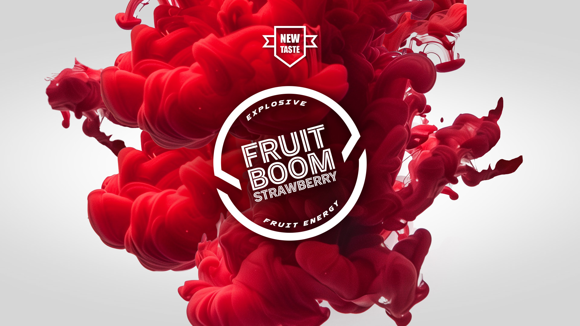
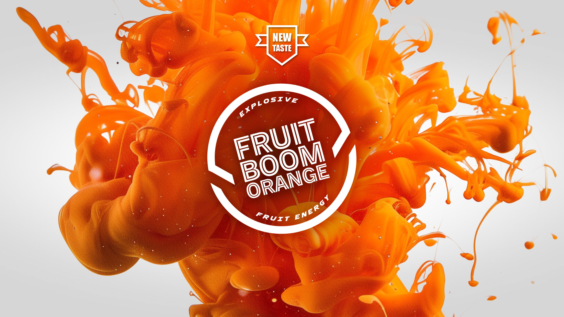
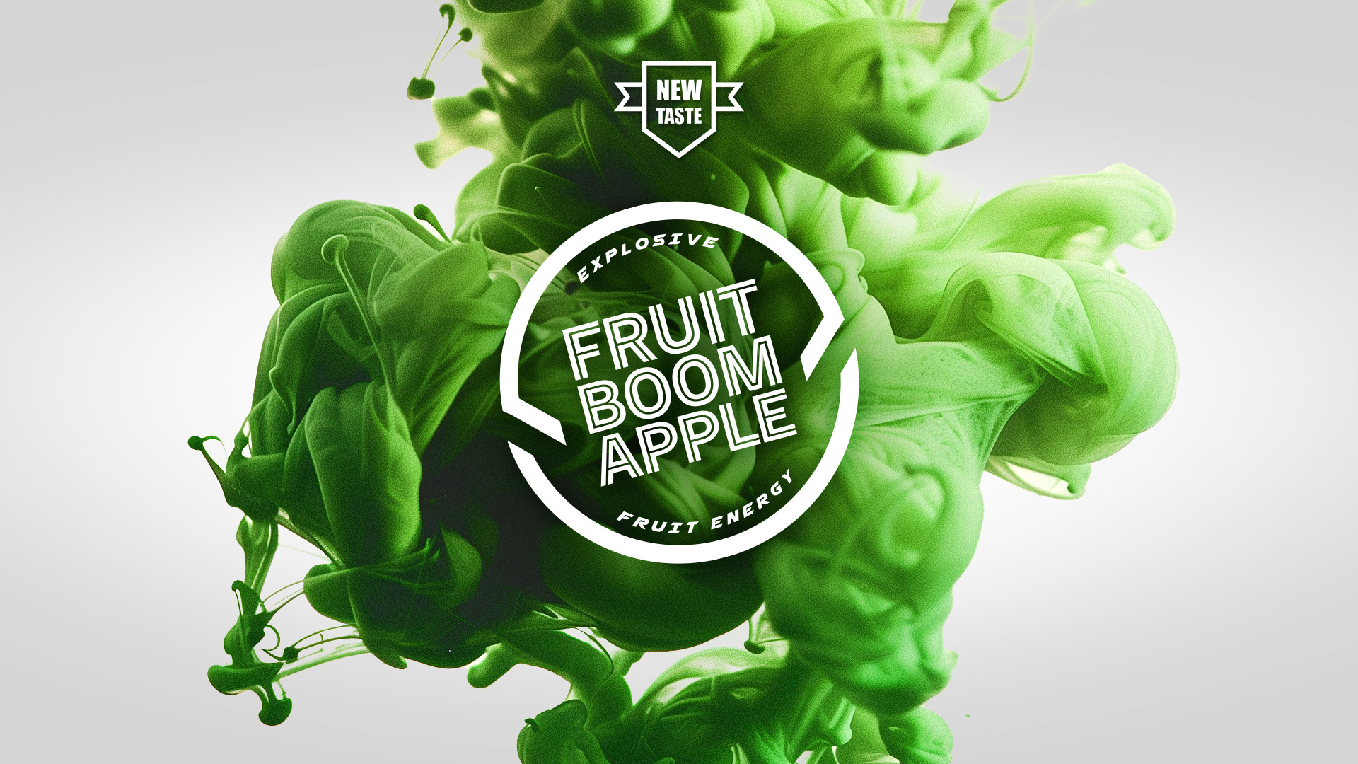
A bold identity system built for visibilityI designed a custom logotype with strong movement and energy, supported by flavour-coded colour systems:
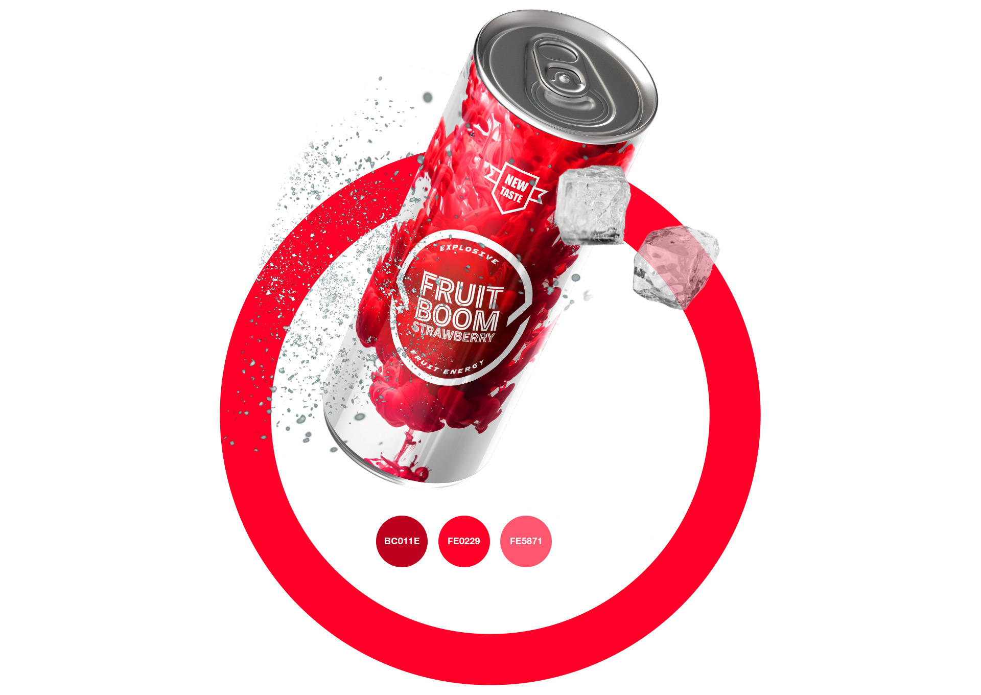
• Electric red for Strawberry
• Bright orange for Orange
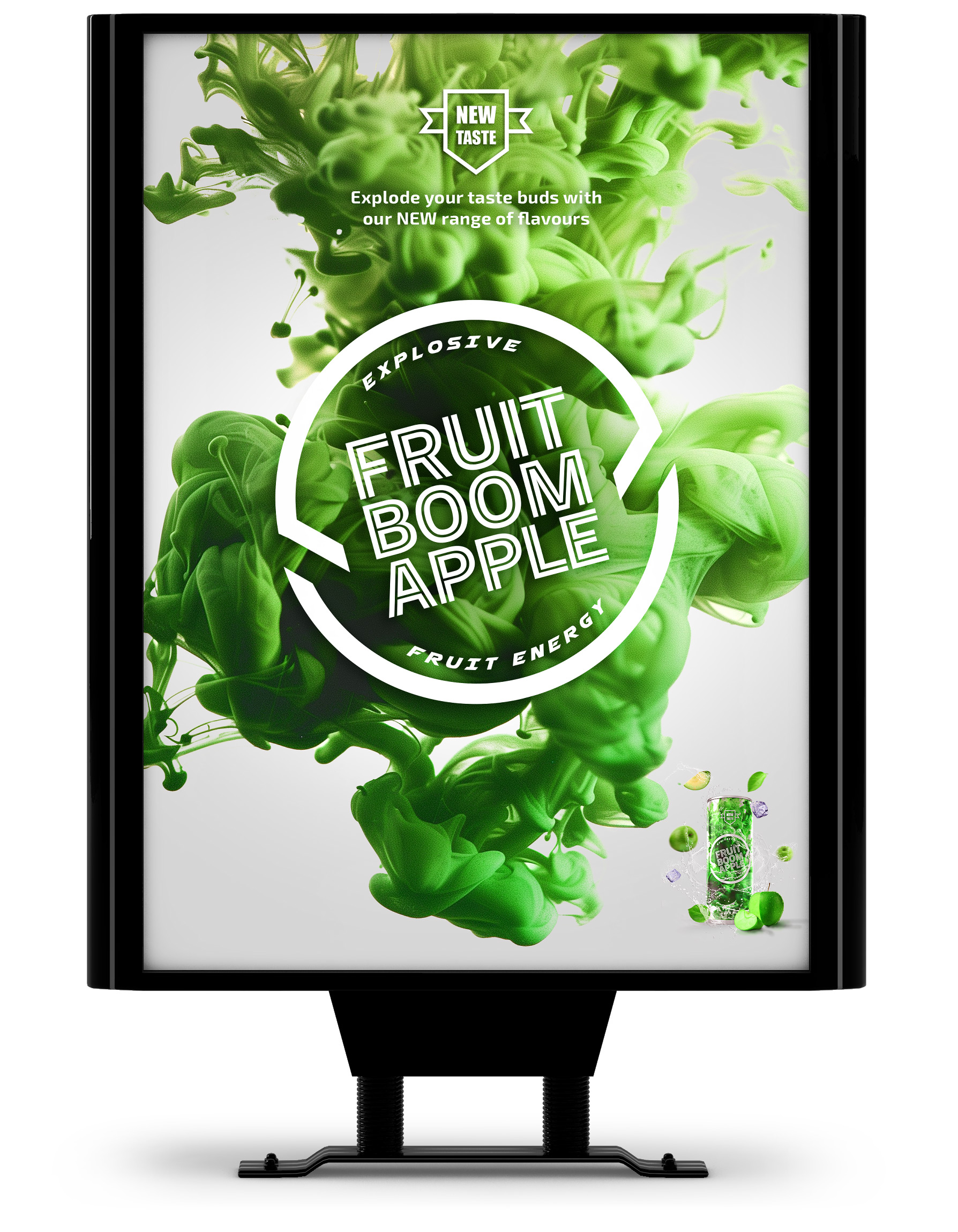
• Neon green for Apple
The goal: Stop the eye first—then win the purchase.
A full visual style guide ensured consistency across packaging, digital, OOH, and promotional rollout.
The Strategic Idea
Don’t sell fruit. Sell impact.
The core insight was simple. People weren’t buying another fruit soda—they were buying energy, excitement, and personality.
The brand needed to feel like an experience.That led to the central idea:

Not a flavour story but more of a feeling. The identity was built around motion, impact, and controlled chaos—positioning the product more like an attitude than a beverage. This created stronger emotional ownership and clearer differentiation on shelf.
The Outcome
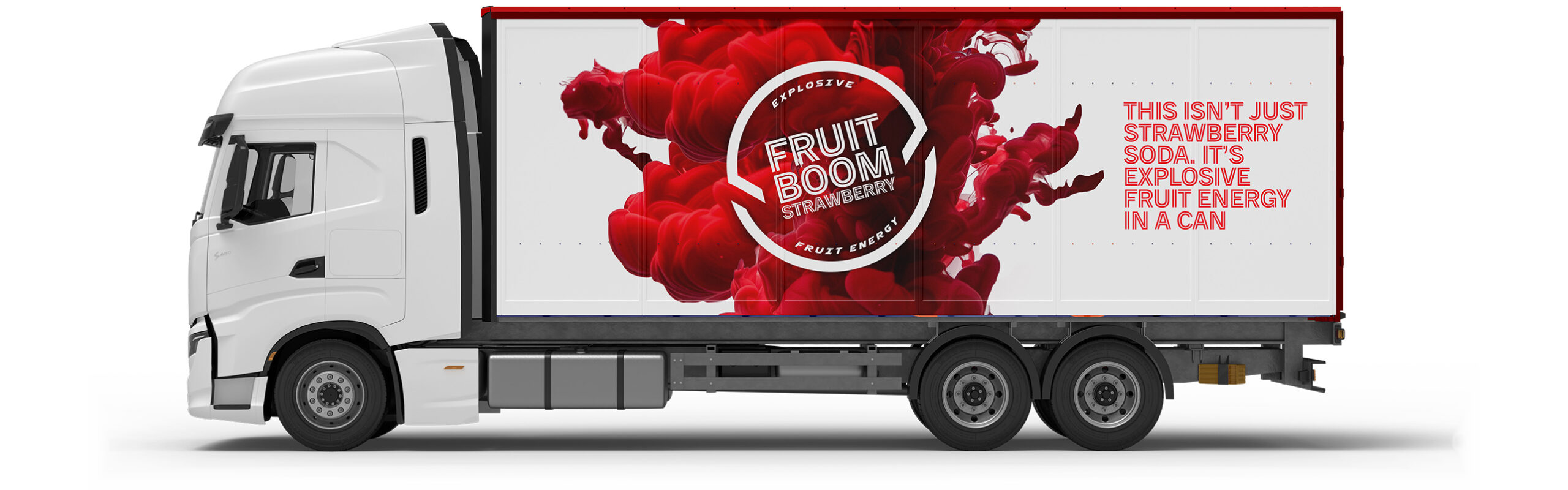
A 360 campaign built for visibility with the identity system rolled out across:
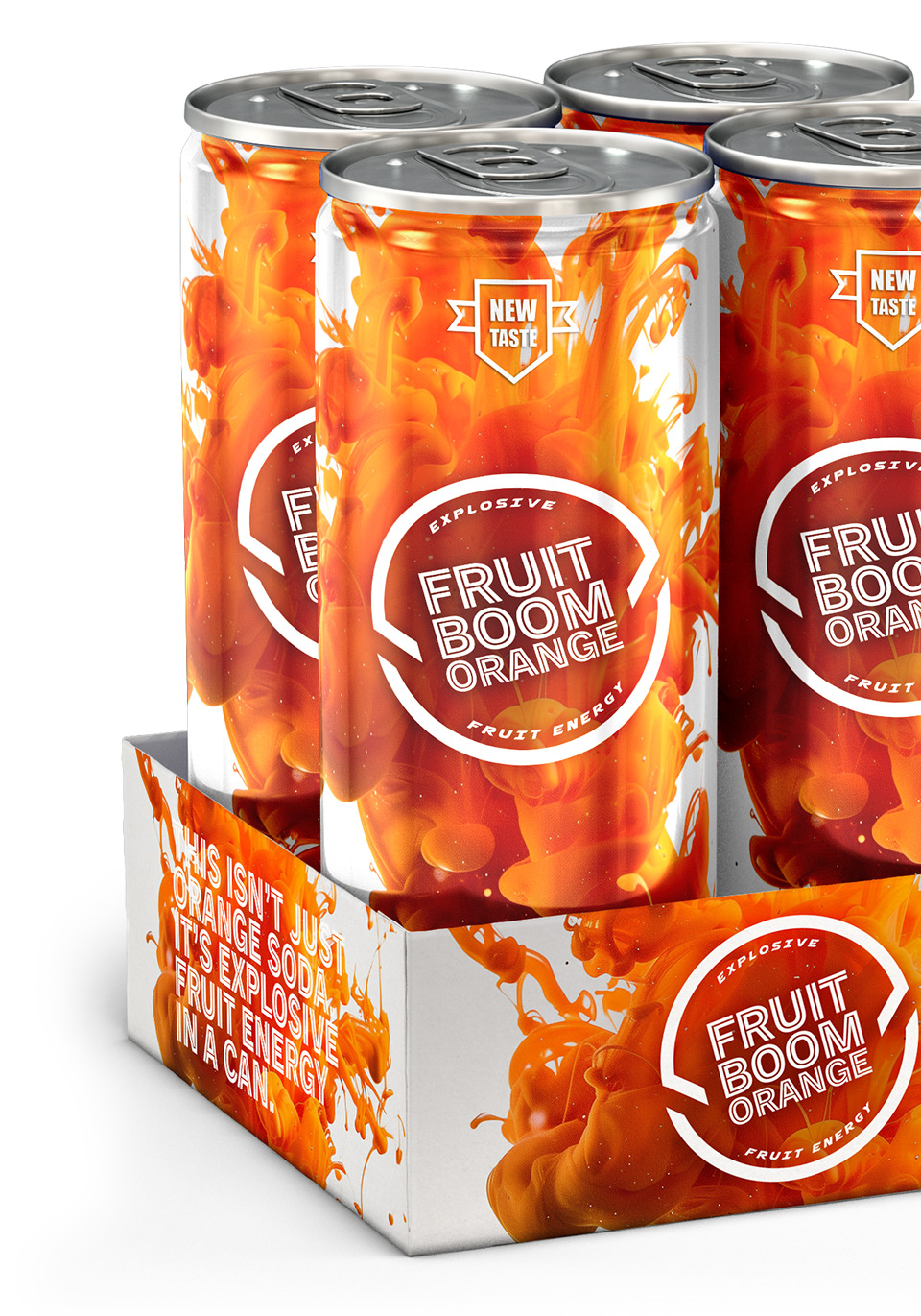
PACKAGING
SOCIAL MEDIA
WEBSITE
MOBILE APP
OOH
EVENTS
VEHICLE LIVERY
PROMOTIONAL ASSETS
The result was a brand built to feel memorable, energetic, and commercially competitive from day one. The Client feedback said it best:
“We asked for Wow. We got Wow.”




Key Visuals
Built around the idea of Explosive Fruit Energy, Fruit Boom’s visual identity was designed for instant shelf impact. Dynamic burst motifs, exploding fruit illustrations, and comic-inspired motion lines create energy and movement, while bold typography reinforces personality and playfulness. High-contrast colour systems—electric red, orange, and green—differentiate flavours while maintaining consistency across the range. The result is a distinctive, memorable packaging system designed to stop the eye first—and win the purchase.